Controls, bindings, and a fuller reference storefront
A build note on live Shopify bindings, real editor controls, undo, and a reference storefront that now covers cart and search.
Last updated: September 15, 2026
The June 13 note covered the first recognizable editor shell. This pass was about making it usable for ordinary theme work.Update, July 2026: The storefront later moved from SvelteKit to Astro and the shared runtime was split into smaller packages. This post describes the earlier implementation at the time it shipped.
The editor got real controls and live bindings. The reference storefront became more than a homepage demo: cart, search, password, collection, and product routes are all part of the loop now.
SDK shape
The shared runtime split into clearer domains: content, theme, schema, registry, and storefront integration. The goal is boring but important: editor, storefront, and CLI should share the same model instead of each inventing one.
See the Storefront SDK docs for the longer version.
Settings can bind to Shopify data
Settings can bind to live Shopify data now: product titles, collection handles, shop name, and other resource fields.
Containers can also drive repeaters. A collection can render one child tree per product, while the editor still shows enough structure to make it clear what is data-driven and what was placed manually.
The editor surfaces compatible bindings through tokenized inputs and a source picker. Inspector selection follows the right repeater instance instead of just selecting the block type.
See Dynamic Sources.
Real controls
Opaque text inputs are not enough for a theme editor. SettingControl now routes the setting types the starter theme actually uses:
- color pickers
- icon search
- font dropdowns
- HTML and CSS editors
- range sliders
- segmented choices
- image and video pickers
- resource pickers for products, collections, blogs, articles, pages, and link lists
- multi-select resource lists with drag reorder
Theme color mode
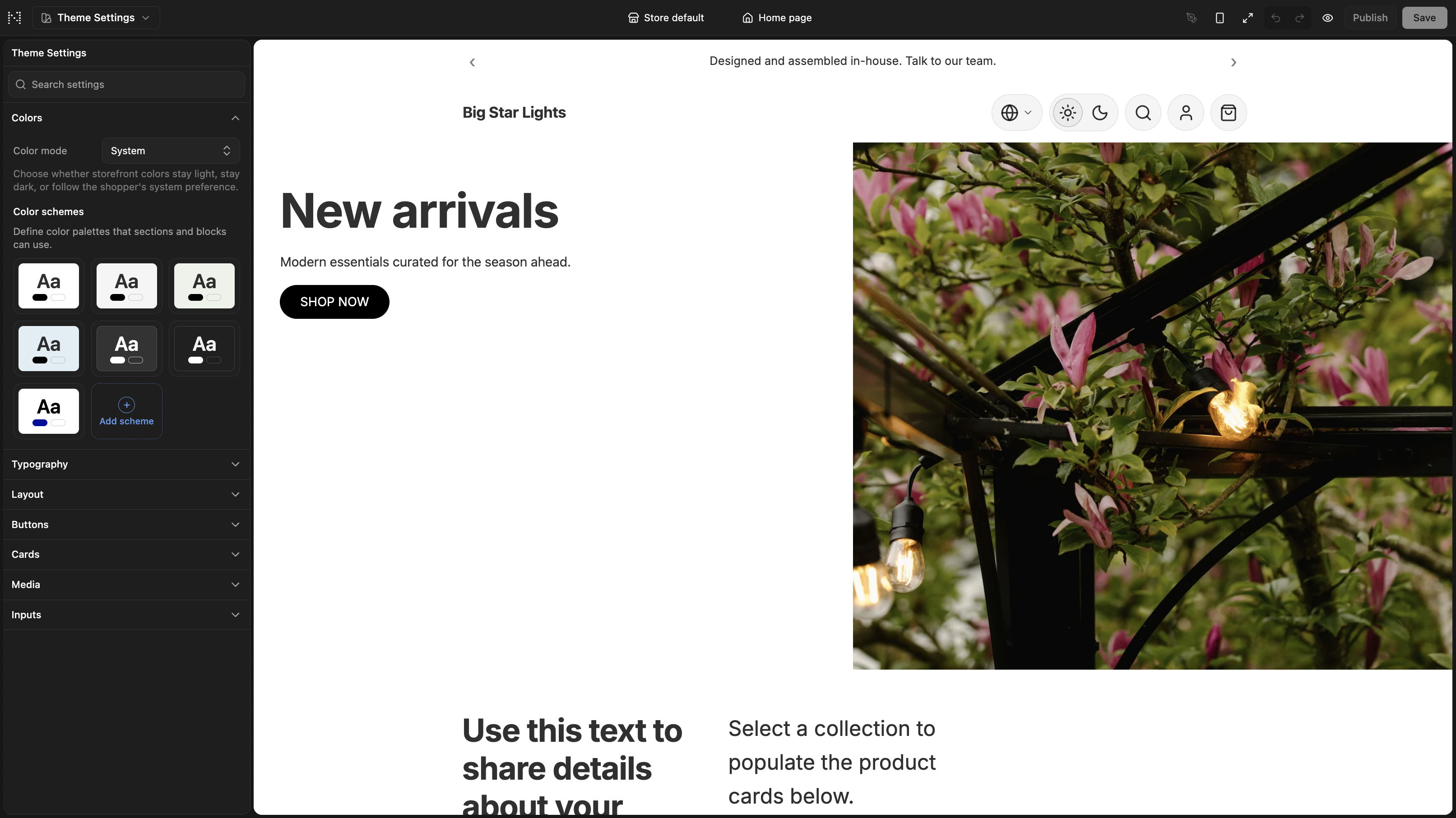
Color schemes became editable. You can rename and tune palette roles, see live previews, and save the generated values into settings_data.json.
A global color mode setting also landed: light, dark, or system. This is shop-facing, separate from editor preferences.
Editor preferences
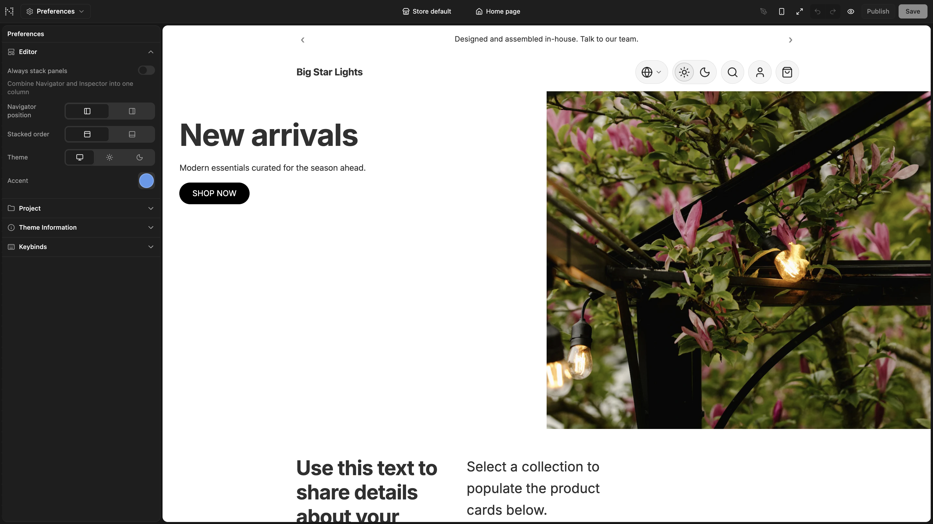
Theme settings configure the shop. Editor preferences configure the workspace.
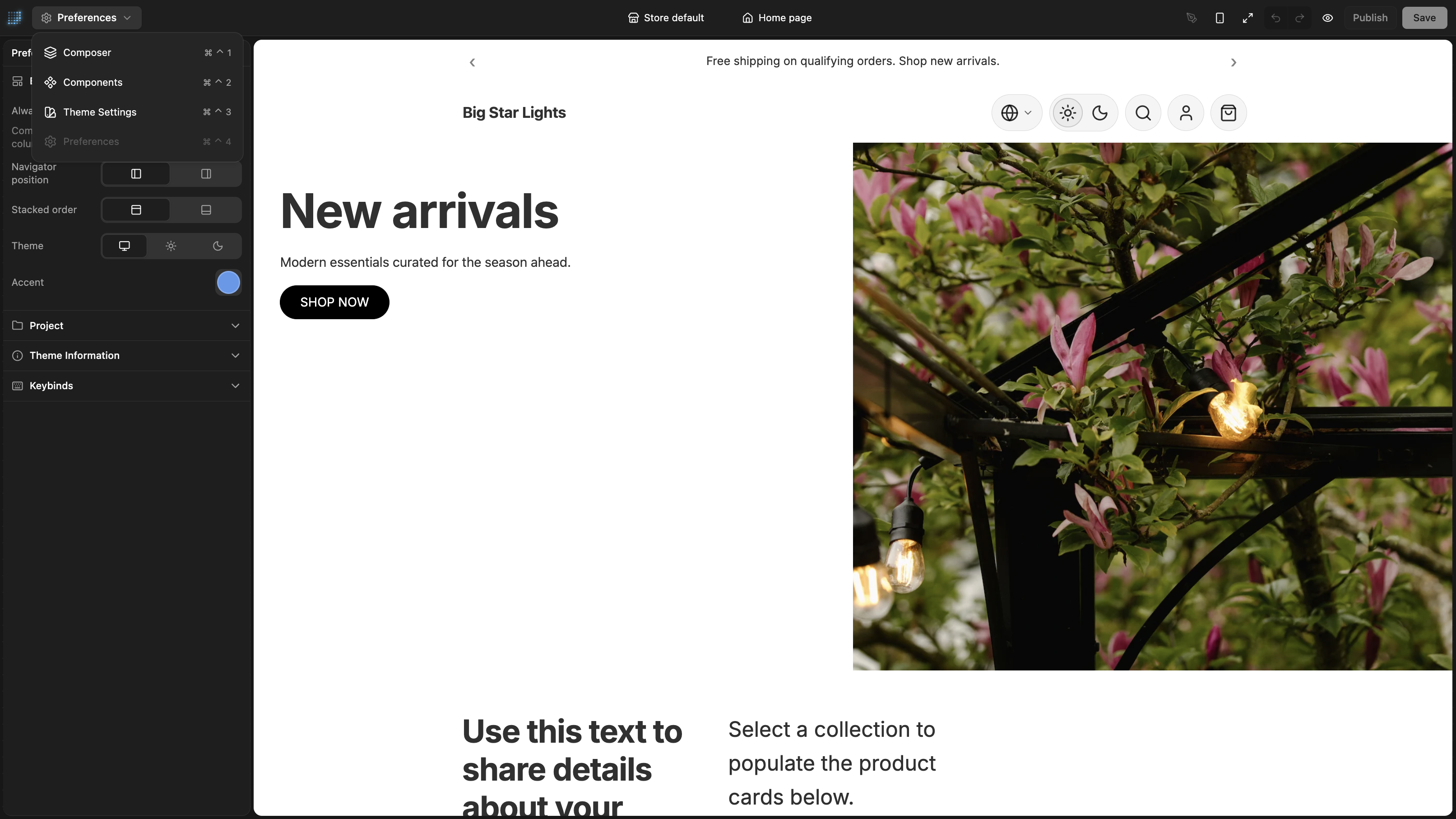
The View menu now switches between Editor, Components, Theme Settings, and Preferences. Preferences holds panel layout, editor appearance, accent, project connection fields, theme metadata, and keybinds.
Undo by context
One undo stack for everything was too blunt. Reordering a footer section and editing a palette are different tasks.
Undo now keeps separate session-local stacks for Editor, Theme Settings, and Components. Typing in the Inspector batches into a single step so Cmd+Z does what you expect.
Storefront routes
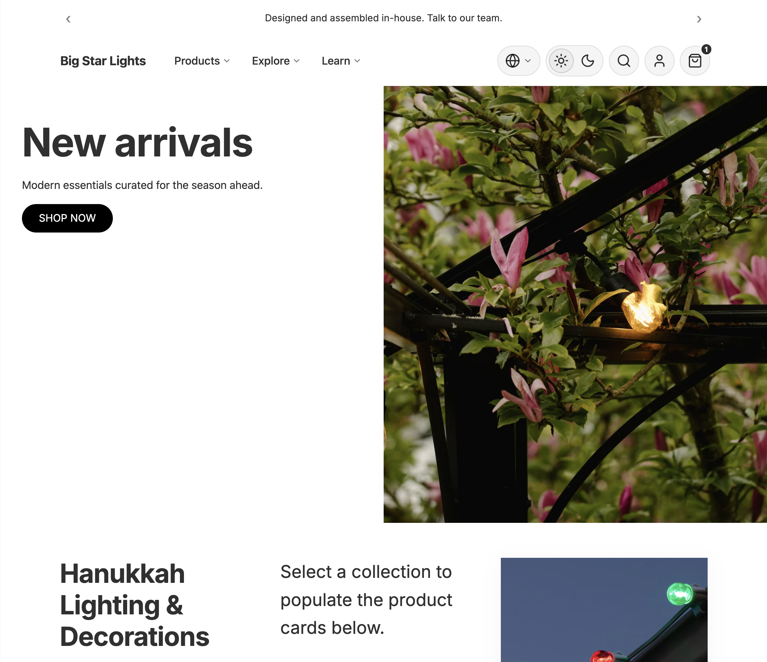
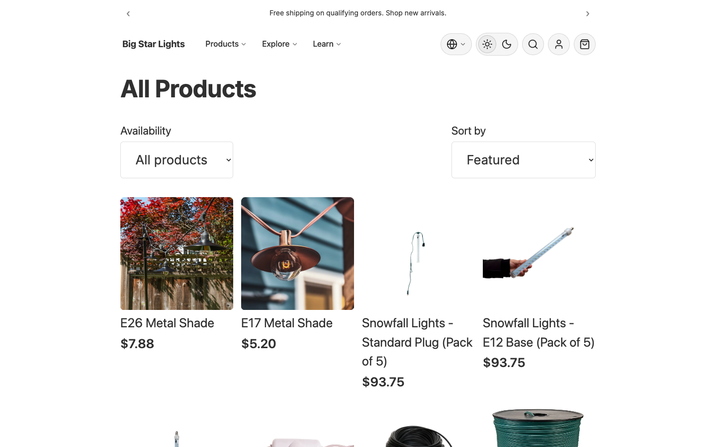
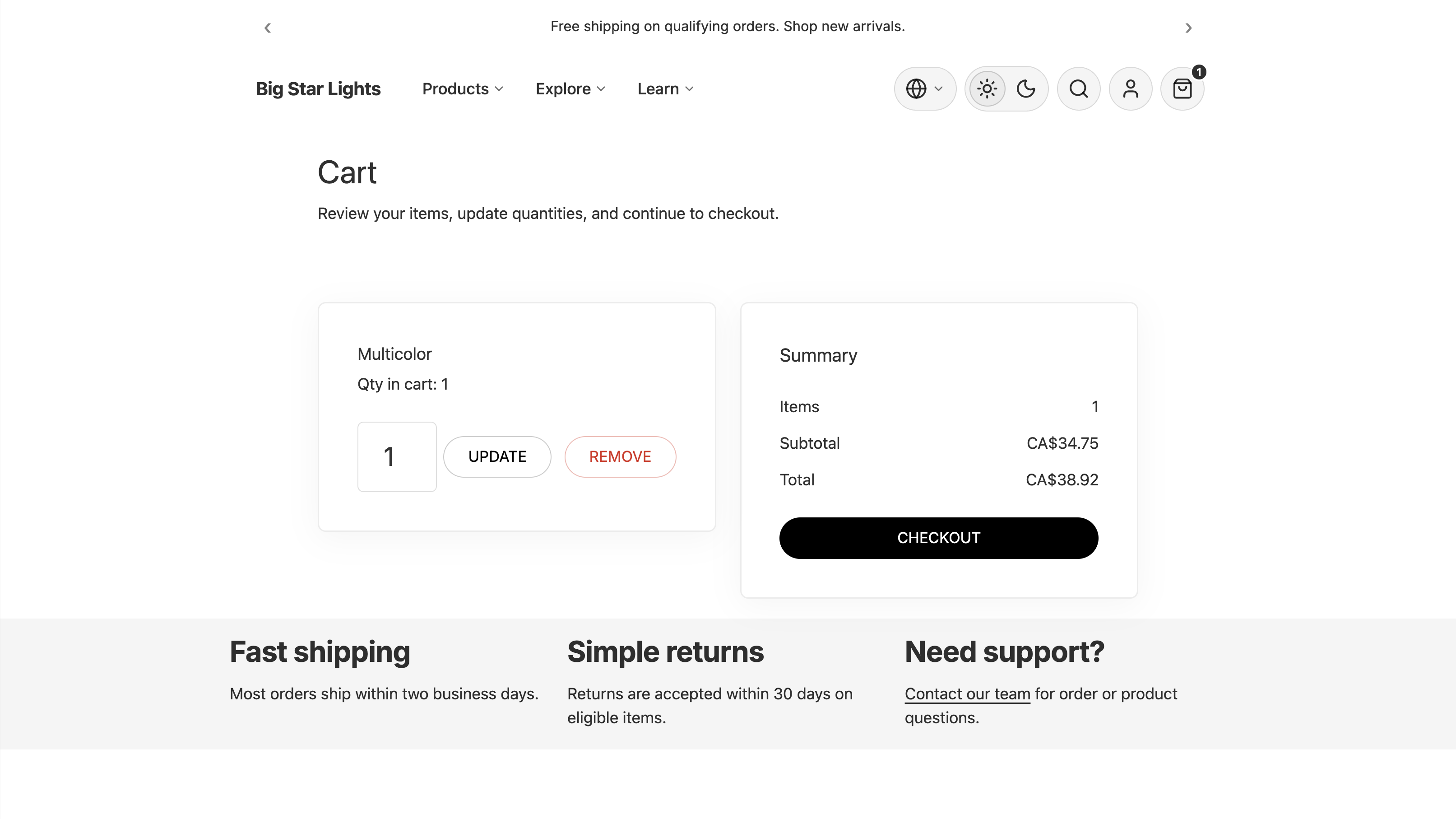
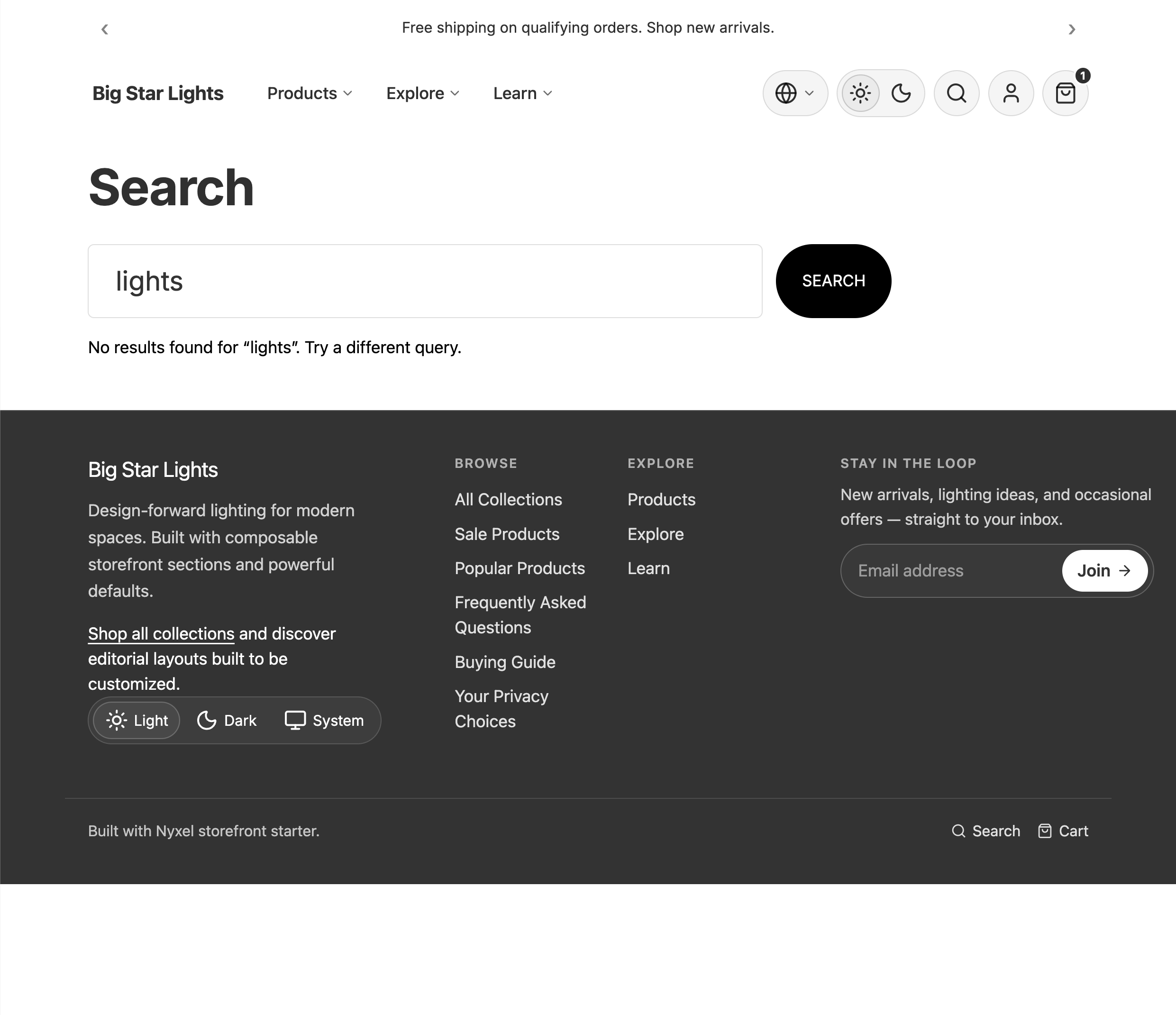
The reference storefront now covers more of the real shopping flow: cart, search, password gate, and 404 joined the existing home, product, collection, blog, and article routes.
Cart routes use server actions and line updates. Search has a query UI and predictive endpoint. The header and footer are block trees, not hard-coded shells.
The less exciting fix here was probably the most important one: component usage is audited now. Registered components should actually appear in templates, or the check should fail.
Next
The next work was draft persistence, preview links, publishing, richer component preview fixtures, Bridge basics, and lighter drag-and-drop internals.