The editor fits in your pocket
Nyxel's editor now has a mobile layout, lighter drag-and-drop internals, and updated starter theme defaults.
Last updated: September 15, 2026
The editor needed a mobile pass. Before this, opening it on a phone meant getting the desktop UI squeezed into a screen that was too narrow for it: side panels, icon rail, preview controls, and hover-only affordances all competing for the same space.
This update gives mobile its own layout instead of trying to shrink the desktop one.
What changed
The composition tree now uses Atlassian's @atlaskit/pragmatic-drag-and-drop instead of dnd-kit. The main reason was practical: the editor needed better tree behavior and touch support.
That changed a few things:
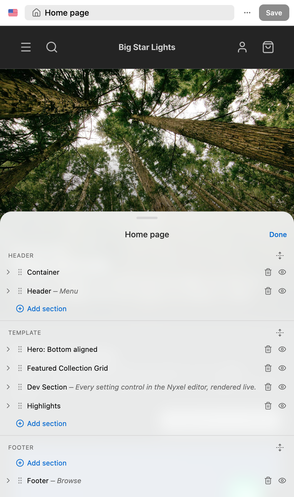
- rows can reorder before or after another row
- blocks can be dropped into compatible containers
- collapsed containers can expand while dragging
- the same drag model works on mobile instead of being desktop-only
One sheet instead of side panels
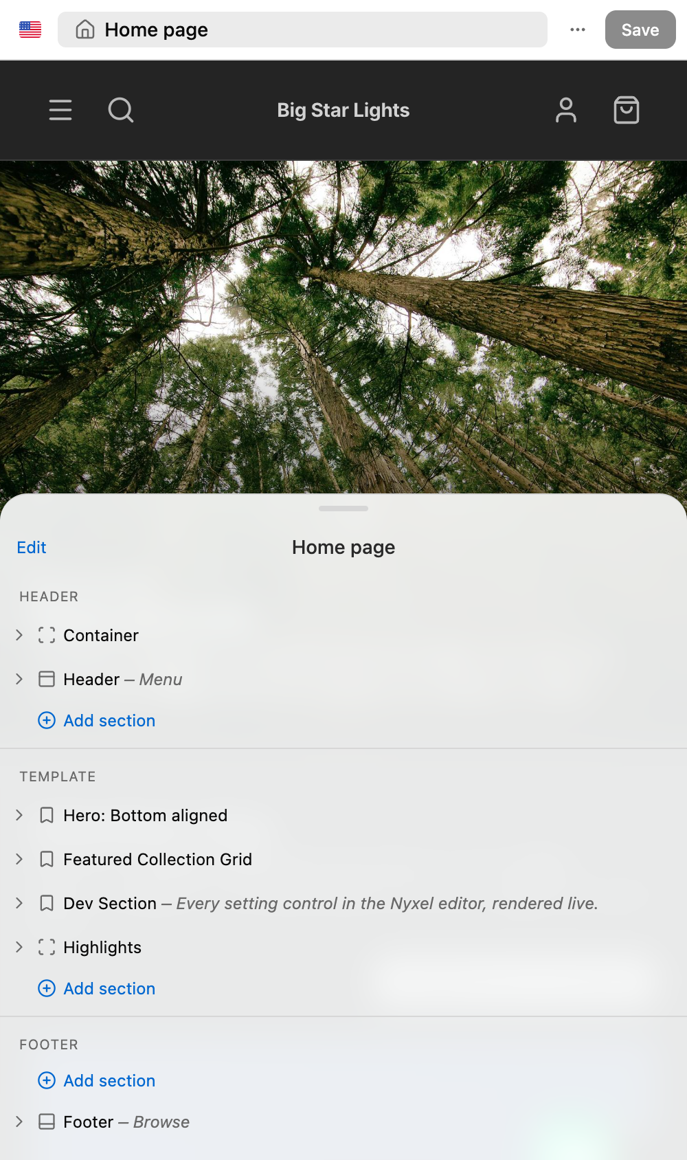
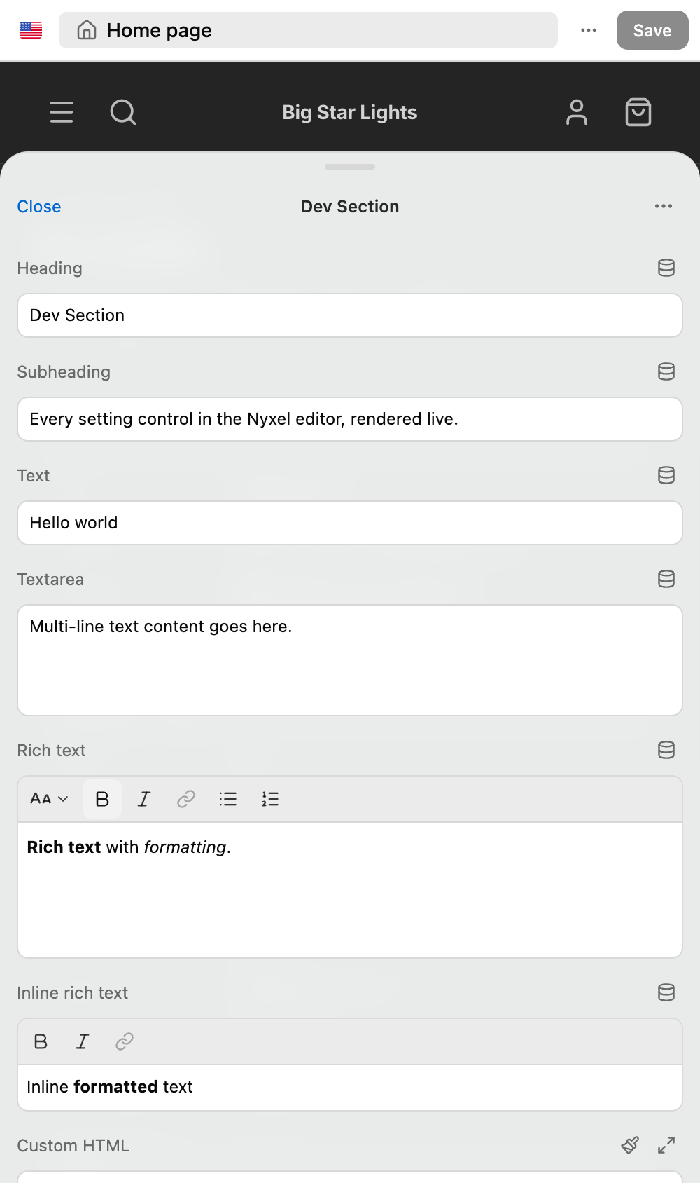
On mobile, the editor has a top bar and one bottom sheet. With nothing selected, the sheet is the Navigator. Select a section or block and the same sheet becomes the Inspector.
The sheet can sit low, open halfway, or expand higher. It should open only as tall as it needs to be, not default to a huge panel just because the viewport allows it.
The top bar keeps only the things that need to be reachable all the time: market, template, options, and Save.
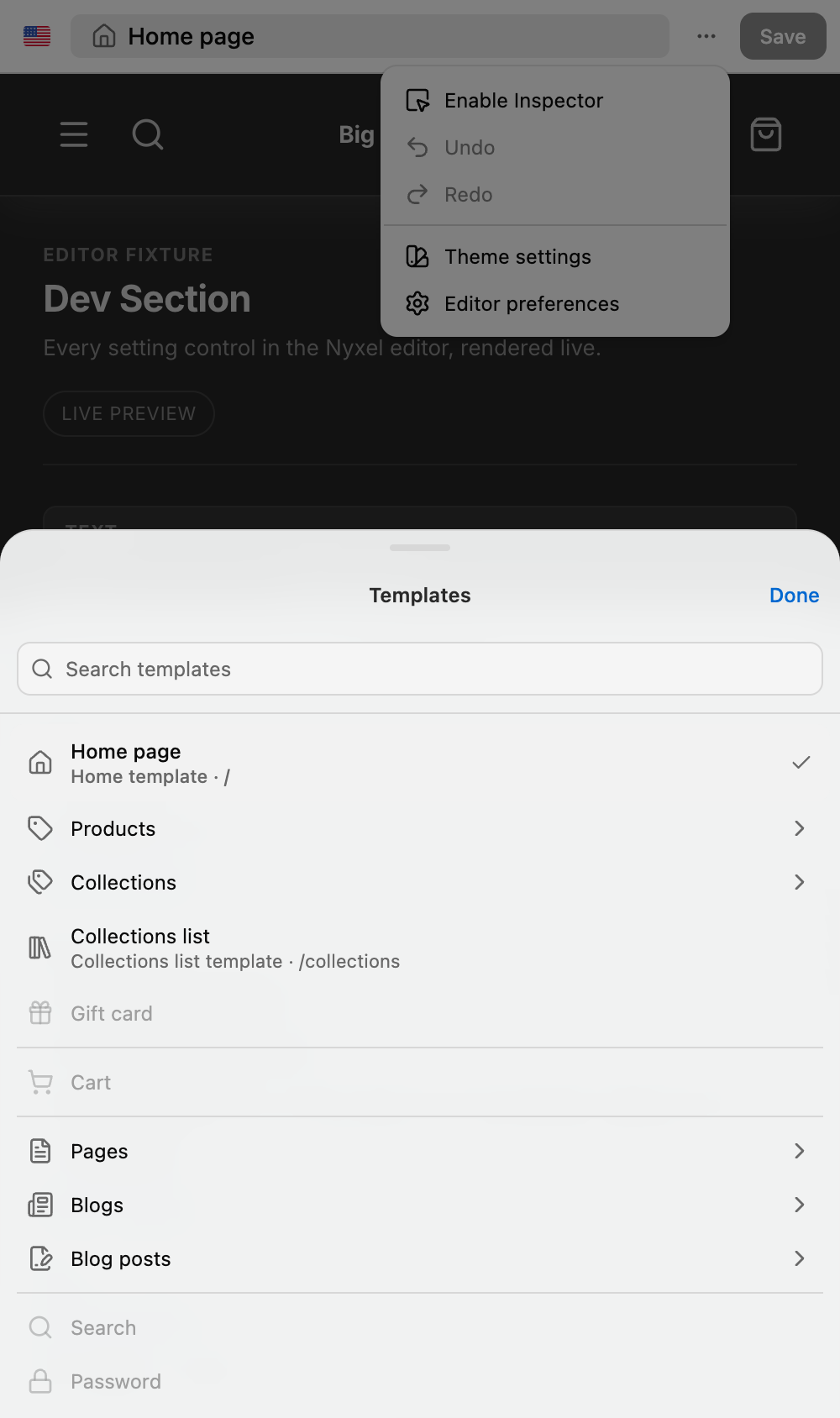
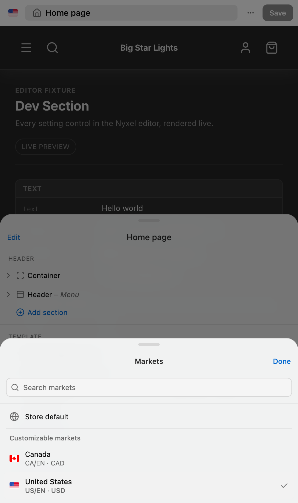
Template and market pickers are sheets too. They darken the preview behind them because they behave more like popovers than persistent panels.
Smaller details that matter
A few of the changes are small, but they make the UI easier to understand on a phone:
- tree rows can show text snippets under the section or block name
- drag handles replace the node icon in Edit mode instead of sitting on top of it
- Theme settings and Editor preferences open as mobile sheets, not desktop panels floating over a sheet
- the market and template buttons update their icons when the selection changes
- the first Inspector-mode transition can show a short hint explaining that the preview is tappable
Starter defaults are part of the product
This also updates the starter theme JSON. Those files are not disposable config. They define the demo storefront and the first state someone sees in the editor.
The collection template now has a collection-aware hero and the featured collection grid is wired through the registered section instead of sitting as unused component code. The product template now uses the product header block directly. That matters because nyxel check should pass with the starter defaults as committed, not only with local editor state.
Storefront fixes
Two storefront CSS fixes landed in the same pass:
- mobile header icon clusters no longer have a gap between adjacent icons
- mobile page gutters are narrower instead of using the desktop spacing
Still rough
This is not the final mobile editor. Drag-and-drop still needs more real-device testing, and the bottom-sheet details will probably keep changing as more controls move through it. The important part is that mobile is now a separate interaction model, not a compressed desktop layout.
Try it on your phone at editor.nyxel.dev, or read how the Visual Editor fits the rest of the stack.